As a chef and/or restaurant owner, you’ve spent countless hours working on the color scheme, the feel, the graphics, the typeface for the menu and the soundtrack of your restaurant’s website. You’ve just spent a bundle of money with that very creative agency or hipster graphic designer to build it. The result is the ultimate reflection of your philosophy and style. It’s cost you more than a Pacojet or two, but it’s slick. But here is the thing: It’s also costing you business.
Why? Because Adobe Flash, the much-heralded plugin providing video, music, animation and interactivity to websites isn’t supported by many mobile devices.
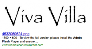
So right now, if you have that flashy website, do yourself a favor and look at it on an iPhone or iPad. Chances are good you will see something like this:

Menus and Mobility
Flash was once the savior of the Internet by providing experiences that HTML could not. Now, apart from playing video on the Internet (from sites such as HULU and YouTube), the days when Flash was necessary to create much of this content are passing. And passing rapidly. Apple has sold nearly 100 million devices that can access the Internet but do not have the Flash plug-in to see that fancy website you blew all that money on. That’s like turning away customers because they don’t have a tie or a jacket.
So why has something that was once a de facto standard on the Internet under attack? Apple has basically declared war on Adobe’s Flash, refusing to allow it to be installed on their new devices, such as the iPhone, iPod Touch and iPad (of which more than 3 million have already been sold). This new class of device differs from the old smartphones such as the Blackberry, in that they offer a truly useable Internet experience, far better than previous devices and far better rendering (what the Internet pages look like) than browsers such as Internet Explorer. Despite the ranting of the Adobe-sponsored bloggers – who make Gordon Ramsay appear well-balanced – Adobe only recently released a Flash player for mobile devices having promised it for several years. But Flash, a technology that is now very mature for desktop and laptop computers, still crashes often on my machines.
Apple’s Steve Jobs has a point when he says Flash is a memory hog and the single biggest reason browsers crash on Apple computers. While Jobs loves his little ecosystem selling you music, applications, TV shows and books from their own store, when it comes to the web Jobs sees open standards such as HTML5 (the latest incarnation of HTML) as the future – and that’s a future where Adobe’s Flash is relegated to the ‘remember when’ category, just like when RealNetworks and their Real player was once the standard method of delivery for video and audio on the Internet. As it stands Google, Microsoft and Apple are right behind the adoption of HTML5 as the technology that ‘runs’ the web.
The days when Flash was necessary to create video, audio and interactivity are passing. And passing rapidly.
Flash Forward
Regardless of the outcome of this battle (and my position is that Flash, like a soufflé, will not rise twice) you need to stop blocking people at your front door if you have a Flash-only website to promote your business. Even when we do have Flash-enabled computers, Flash can be buggy and painful to use. If I’m writing about a restaurant and just want to check the chef’s CV, I don’t want to sit through a pointless animation. I don’t want to have to roll over the entire screen with my mouse or finger looking for a hidden menu to get to the actual restaurant menu. I want to get the name of that little Basque place that the chef worked at in the south of France right when I write about it. I want the correct name of the dish that I loved so much that I’m willing to put the whole description of it in my story. If I like your place enough to write about it, make my life as easy as possible. Food and travel writers that I’ve spoken to loathe Flash websites. Designers and programmers using Flash to build restaurant websites appear to enjoy making it as painful as possible just to get the damn address and phone number of your business. So how is that helpful?
If I’m out and about and someone recommends a restaurant in the town that I’m visiting, I want to be able to check it out online and maybe make a reservation. If I’m using an iPhone, iPod Touch or iPad I can’t ‘see’ your business if your website is in Flash only. Recently in New York, a high percentage of the websites of restaurants that I wanted to visit were done in Flash – entirely useless to me if I want your phone number or opening hours. Sure I’ll find it through Google, but a blue lego brick does not make me salivate in anticipation of dining there.
There are other more practical reasons to not use Flash or provide a simple alternative. For example, when you expand to Dubai or Vegas (and you probably will soon), you must go back to the design firm to get the original files. You can’t just ask someone else to update the website. So your flexibility is greatly limited.
Open Your Doors
When you commission someone to design your website, ask two questions:
“Will customers be able to see it on all devices?”
“Will I be able to see it on my iPhone, iPad or Blackberry?”
Get them to show you websites that they have done and view them on various devices. If all you see is the ‘blue lego brick’ instead of a web page, you are not doing your customers or those writing about your restaurant any favors.

Agree on the mobile issue… but as a Web designer and Flash designer, I’m compelled to point out that it isn’t my goal to make site navigation painful. Most restaurants seem to have bought a website ‘template’… and those are flashy, cranked-out messes of code and design. I would love the opportunity to create an easily-navigable, mobile-accessible site for an eatery.
Dave (DiningInLA),
Most of the really bad interface designs that I have seen are not from template-based designs, but rather agencies who have been paid good money to come up with something ‘original’. It would be unfair of me to single out one – but NYC has it’s fair share of rubbish Flash restaurant web designs. At the very least the site should offer or fall back to HTML.
Thanks for your comment.
Actually, the problem isn’t having a website built in Flash, it’s having a website ONLY built in Flash. I’m a website designer and, way back when, when Flash wasn’t as popular, everyone coded their sites with alternative methods in case someone didn’t have the plugin. I’m not sure what caused the stoppage of that practice. Instead of telling restaurants that they can’t have rich media sites is not the answer; instead restaurants should start demanding that their web identity providers include means to view a site without specific plugins. I can’t even count the number of times I just wanted to view a restaurants menu while travelling only to find the site unuseable. Needless to say, I didn’t dine at those restaurants.
I love this article, since my company helps businesses solve this problem! We create TextSites which are menu-driven text messages accessible by 96% of phones on the market (no downloads). We can easily enable you to retrieve that CV or menu or phone number or hours of operation simply by you sending one text message. If anyone wants to see a TextSite, just let me know.
It is possible to have both, Flash and a great mobile experience. Have you seen Cloversites.com? They put Flash on the computer and also create a mobile version.