
Burger Recipes: The Ultimate Collection
Developer: feathermoor
Cost: $1.99
Runs on: iPhone
Website: www.feathermoor.com
 Nothing screams American cuisine like a burger. It’s a simple concept—a piece of meat between two pieces of bread—that is open for interpretation; cheap or gourmet, beef or turkey, meat or vegetarian. Don’t get me started on the condiments, toppings or the bread. Each of these choices opens the door for endless variation, making your perfect burger as custom and individual as you. Now that’s American.
What is shocking to me is that there’s not a lot of choice for burger-cooking apps. Today, I’m looking at Burger Recipes: The Ultimate Collection. In short, this app provides 37 burger recipes with the ability to add your own. Just off the bat, shouldn’t the “ultimate collection” have more than just 37 recipes?
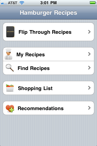
When you open the app you’re presented with a few navigation options: Flip Through Recipes, My Recipes, Find Recipes, and Shopping List. Unfortunately, there is no global navigation system that can be accessed from anywhere, meaning as you dig into the app you’re left with a “Back” button to crawl your way out. The app isn’t extremely deep so it’s not too much of an inconvenience, but nevertheless is a pain and a significant design flaw.
 Speaking of looks, overall the app is pretty bare and minimalist. Each recipe has a picture, but many times the image seems to be something related to the recipe and not of the recipe (or burger) itself. For example, the Thai Burger shows a picture of a lime—no meat, no bun, just a picture of a lime. I don’t know about you, but seeing a picture of a lime doesn’t make me want to try a burger recipe.
In terms of the recipes, each has a list of ingredients and instructions. Some of the recipes look pretty dang good, but if all you wanted was a single recipe you probably wouldn’t spring for an app, right? There’s nothing special about how the recipes are presented, but they certainly could use a little editing. For example, jalapeño is misspelled in the Tex Mex Burger (or is it Tex-Mex? They have it written both ways) because the “ñ” is garbled.
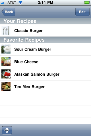
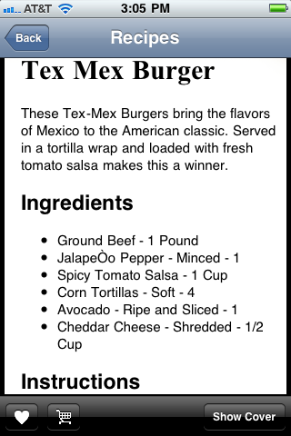 Each recipe has two buttons, one to add the recipe to your My Recipe page and another to add all the ingredients to your Shopping List. Both of these functions are nice features to have, but the Shopping List could use a little help. If, for example, I add two burger recipes to my list that require beef, it doesn’t combine the beef ingredients; meaning I have to scroll down and see if an ingredient is mentioned more than once and then do the math myself. Also, I can’t change the yield of the recipe within the app. I tried adding a recipe to the Shopping List multiple times and all it did was list the entire recipe multiple times. This hardly makes my life easier. Clearing the shopping cart also requires that I check off every single item listed.
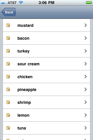
Finding Recipes is nothing more than a list of ingredients that when you click on one it shows you the corresponding recipes that include that ingredient. This is not a very elegant solution. Not to mention, the ingredients aren’t even in alphabetical order: shrimp, lemon, tuna, onions, vegetarian, beans, etc. (Vegetarian listed a second time at the bottom except it’s capitalized upon second reference).
On the surface this app functions, but once I bit into it just a little bit I found it left a bad taste in my mouth.
I’m shocked that an American classic is being so glaringly ignored in the app world; offline the burger wars are relentless. If you have a burger app that I should try please let me know. Until then, I’m going to see if apple pie apps are under-represented, too.
Toque Rating: 2.5/5
Leave a Reply