In the Kitchen
Developer: Television Food Network G.P.
Cost: $1.99
Runs on: iPhone, iPad
Website: www.foodnetwork.com
 There’s an 800-pound gorilla in the food world that we just can’t ignore. I’m talking, of course, about the Food Network. They just released a new (and long-awaited) app for the iPhone and iPad. Up until now, you could get your Food Network fix on your phone through their mobile site (www.foodnetwork.mobi) or through their other free app Food Network Nighttime, which is more about the shows than food. The new In the Kitchen app is all about the food.
When you open In the Kitchen, the main screen offers a Thanksgiving 2010 recipe feature and a scrollable list of the network’s famous chefs below—clicking on a chef takes you to a page of their recipes. At the bottom is a global navigation menu taking you to: Search, Recipe Box, Shopping List, and More.
 The More button provides a cooking timer, unit converter and a few other items. Apparently, these tools have become staples of food apps, and of course I’m a sucker for them. I should say up front, too, that this app is gorgeously designed (as you might hope from such a large entity), is very responsive and extremely easy to navigate. This app adds to what the Food Network already does exceptionally well: delivering synergy between its platforms. This leads into the benefit and detriment of In the Kitchen: If you don’t want to be a part of their world, you won’t be able to take full advantage of what this app has to offer.
The Recipe Box, for example, can only be used if you have an account with the main Food Network website. One problem is that you can’t create an account from the app, you have to go to the website to do so. However, once you’re in their walled garden, the food tastes very good. With the click of a button on any of the thousands of recipes available, you can add them to your Recipe Box, as well as have access to recipes you may have previously saved from the website. The only problem with the Recipe Box is that you can’t add items from within the app to a customized folder you may have created, such as Desserts or Morimoto Favorites.
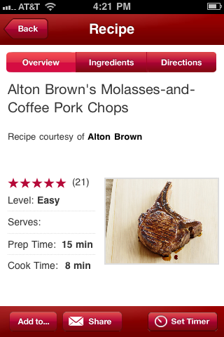
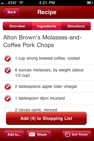
 Clicking on any of the recipes throughout the app takes you to a clean recipe card offering a few bullet points: level of difficulty, user rating, serving size, prep time and cook time. Across the top of the recipe card includes buttons for ingredients and cooking directions. Along the bottom are buttons to add the recipe to your Recipe Box or Shopping List; sharing through e-mail, Facebook or Twitter; and Set Timer.
Perhaps my favorite tool in this entire app is the Shopping List feature. With the click of a button the entire ingredient list (or only the items selected) appear in my Shopping List, which can then be e-mailed if desired. Just be careful not to pester the cook in your house with an endless barrage of recipes. Remember, with great power comes great responsibility.
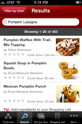
 The one feature that could use some work is the search function. It’s a little slow, doesn’t provide the most relevant results up front, and doesn’t seem to filter irrelevant items. For example, I searched “pumpkin” and got 243 results. I then refined my search to “pumpkin lasagna” and it boosted my results to 403, instead of limiting them. It would also be nice if users could search by their favorite chef, but they can’t.
I suppose you don’t get to be the gorilla in the room unless you do things well, and despite the minor flaws, The Food Network has really cooked up a winner with this app.
Toque Rating: 4.5/5
Leave a Reply