
Karen Martini
Developer: Karen Martini Media
Cost: Free (+ in-app purchases)
Runs on: iPhone
Website: www.karenmartini.com
Version: 1.0
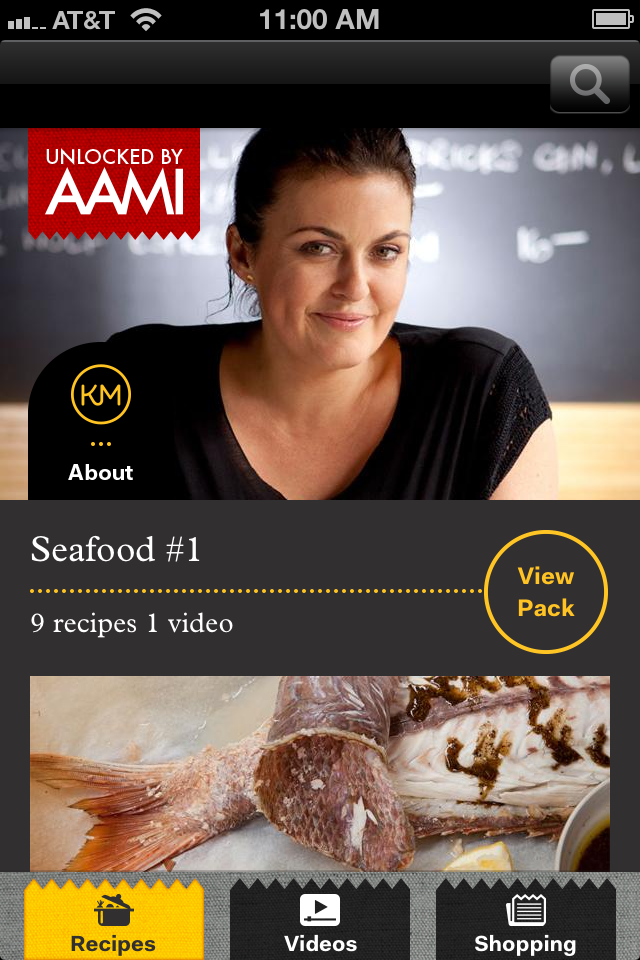 Watch out, the Australians are coming! This past weekend golfer Adam Scott became the first Australian ever to win the Masters Golf Tournament and less than two weeks earlier, renowned Australian chef Karen Martini introduced her first app for the iPhone and iPad bearing her name. Let’s see if this tall poppy is dux with her app or if it’s bodgy and not at all my cup of rice (translation: Let’s see if this successful chef is top of the class with her app or if it’s of inferior quality and not my thing.)
Like many high profile chef apps Karen Martini is free with additional recipe packs at an additional cost (however at launch, six bonus recipe packs are available for free). Since the recipe packs are currently free I don’t have a price for them, but a preview image on iTunes shows a 10-recipe pack available for $1.99.
 The app is pretty straightforward in terms of what you get—that is, recipes and a few videos. After you open the app (which is really slow to load) you can scroll through the various packs, which are organized by themes: Something Sweet, Asian Inspiration, Pasta & Risotto, etc. Each pack includes roughly 10 recipes and most include at least one video, but none in this first go-around include more than three. In addition to the recipes, the bottom of the opening page includes quick buttons to the videos and the shopping list. Overall, the foundation of the app feels a bit like British chef Jamie Oliver’s, but not as polished or robust.
Everything from design and functionality to the multimedia elements, this app feels like it is one step behind. But let me first talk about the good things. The images throughout the app are beautiful, as is the overall aesthetic; and Karen Martini is engaging in the videos, which are nicely shot. With the exception of being unable to jump to the homescreen by clicking the logo, the navigation is clean. And at launch, getting roughly 60 free recipes is a great value for delicious-looking meals.
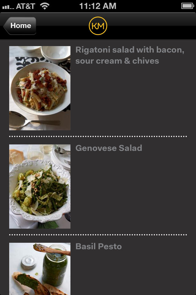
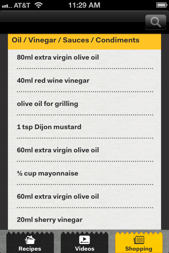
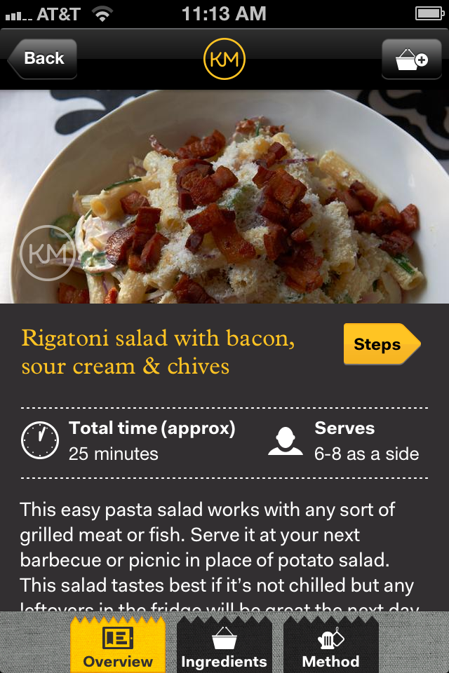 So where’s the room for improvement? Here are a few highlights. The recipe navigation page gives a nice image along with the name of each recipe, but fails to include basic bits of information from serving size to prep time or even difficulty level—a stark contrast from the last reviewed app, Panna (inside the recipe page you do get some of that information). The ingredient list is all in metrics and doesn’t offer an option for standard measurements. The step-by-step instructions are easy to follow and swipe, but don’t offer audio tips like Jamie’s Recipes or include images or horizontal view. In general, there seems to be a lot of wasted space and missed opportunity throughout this app.
Once you find a recipe you’d like to make, you can add the ingredients to the shopping list, which can be e-mailed or texted, but adding an ingredient from multiple recipes duplicates that item in the shopping list instead of combining them. For example, if three recipes call for 100mg of olive oil, the shopping list will add it three times instead of telling me I need 300mg. Also, when adding ingredients, the entire recipe is automatically added.
 Lastly, the search function works, but could be better. You can’t filter your results like you can in Panna and if there’s more than three results, a weird quirk places the last result below the viewing area so you can can’t click on it. I think this might be because it was designed for the iPhone 5, which has a larger screen than on the iPhone 4S I’m testing with, although it should still work properly.
Overall this isn’t a bad app, but I must compare it to others in the category and it’s obvious that it could be more. For all the free recipes available I do think this is worth a download, but unlike Scott, Karen Martini isn’t ace just yet.
Toque Rating: 3/5
Leave a Reply