Developer: Arnold & Pearn
Runs on: iPhone
Website: http://arnoldandpearn.com
Version: 1.0

It always amazes me how creative apps can be. I’m sure there are 1,000 cocktail apps that can show you how to make a Manhattan, but I have yet to see one that informs the way Clinq does. In short, imagine a how-to cocktail guide created by highly skilled designers, not mixologists or even cookbook writers. That’s the way Clinq felt as I used it. No big descriptions, no complicated navigation, and with the exception of some glassware silhouettes no real imagery. Doesn’t sound like it leaves you much, but the design team at Arnold & Pearn have created their own concoction worthy of the $0.99 tab.My first sip of love for this app appears on the opening screen. It’s a white background with five large, bold words: gin, vodka, whisky, bourbon and rum. I know when I’m sifting through my liquor cabinet that’s the way my brain works (Ooh, I have a little vodka left, what should I make with that?). Of course, there are other really great cocktail apps out there that allow for this same type of filtering, such as FOOD & WINE Cocktails or the 2012 app award winner for Best Spirits, Mixology (formerly Mixologist). But unlike those other apps, the simplicity of the design strips away all the bells and whistles so you can get straight to the point, the same way Google.com has done with their plain-Jane search box page.
 Click on any of the base spirits and you are taken to the glassware page. They invert the color on this page so the glasses appear white on a black background, which I think provides a fresh transition and keeps the brain active. One more click on the glass brings up the names of the cocktails. Now, this is where knowing a little bit about the drink you’d like to make helps, because for me I had to click on Sand Dance to know if I would be interested in imbibing or not.
By keeping things simple, it also can leave you wanting just a little bit. I know it’s a whiskey-based drink, but that’s all I know. With 2012 Best Sprits app finalist, Cocktail Flow, for example, I can see an image of the final drink (including the color) and even a few of the ingredients on the page, which may help inform my decision even before I have to click. With Clinq, if I don’t know, I must click to find out.
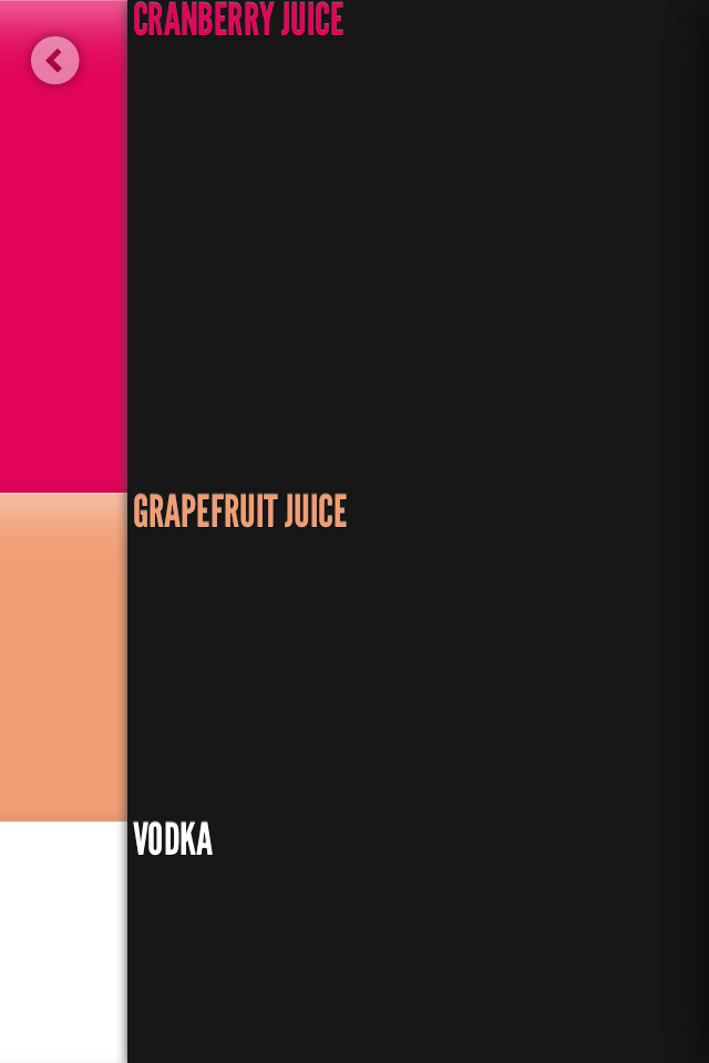
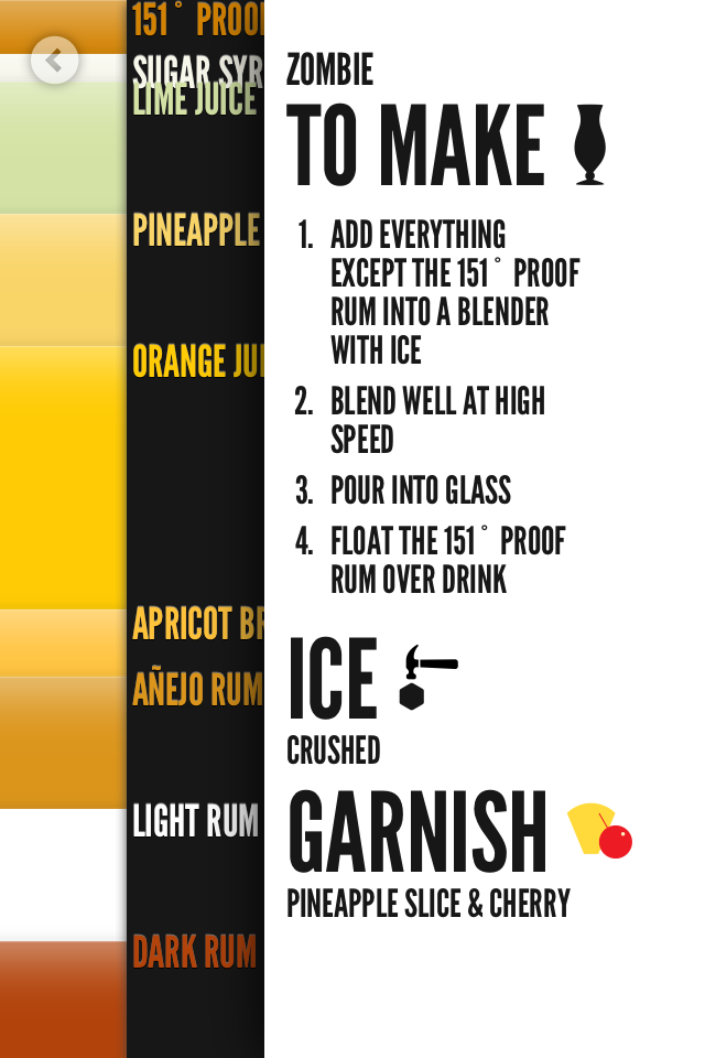
 Now, once a drink is clicked the real genius of this app appears. Rather than a list of ingredients or illegible bottles, you get color bars stacked on top of each other that bleed to the edges of your screen. Each of these color bars represent the drink’s ingredients and appear in proper ratio to make the cocktail. A tap on the right-hand side of the screen will reveal the ingredients; and one more tap will show the actual instructions. Sometimes, I found an ingredient difficult to read because the ratio was tiny and the words overlapped another ingredient.
 When on the homepage there is also a tiny horizontal bars icon that will take you to a list of the 140-plus cocktails; and the top of this page is the search function. Unfortunately, it’s got the cleanliness of Google, but not the functionality. It is slow and searches just the cocktail name—not the garnish, glass or apparently any other information.
Rating an app like this is difficult because I praise it for its simplicity, but I also wish it offered an option to dig just a bit deeper. For example, James Bond couldn’t explain how to make a Vesper as easy as this app, but when looking at the ingredients not everyone will know what Kina Lillet is (an aperitif wine).
I love the design of this app and I am already looking forward to using it again—it’s just that I’ll be reaching for my middle shelf to find it.
Toque Rating: 3/5
Leave a Reply