Divvy
Developer: Helix Interactive
Cost: $2.99
Runs on: iPhone
Website: http://www.divvythatup.com
Version: 1.0.1
 Yeah, yeah, another split-the-bill, tip calculator… except this is the coolest and most useful bill splitter I’ve ever used. Once I began using this app I had a flashback dating many years ago when I watched a demonstration of Microsoft’s Surface table (not to be confused with their new Surface tablet). Anyway, in this demo it showed restaurant patrons putting their credit cards on the tabletop and dragging the menu items into the digital “ring” created by their cards to divide the bill. That’s similar to the interface with Divvy.
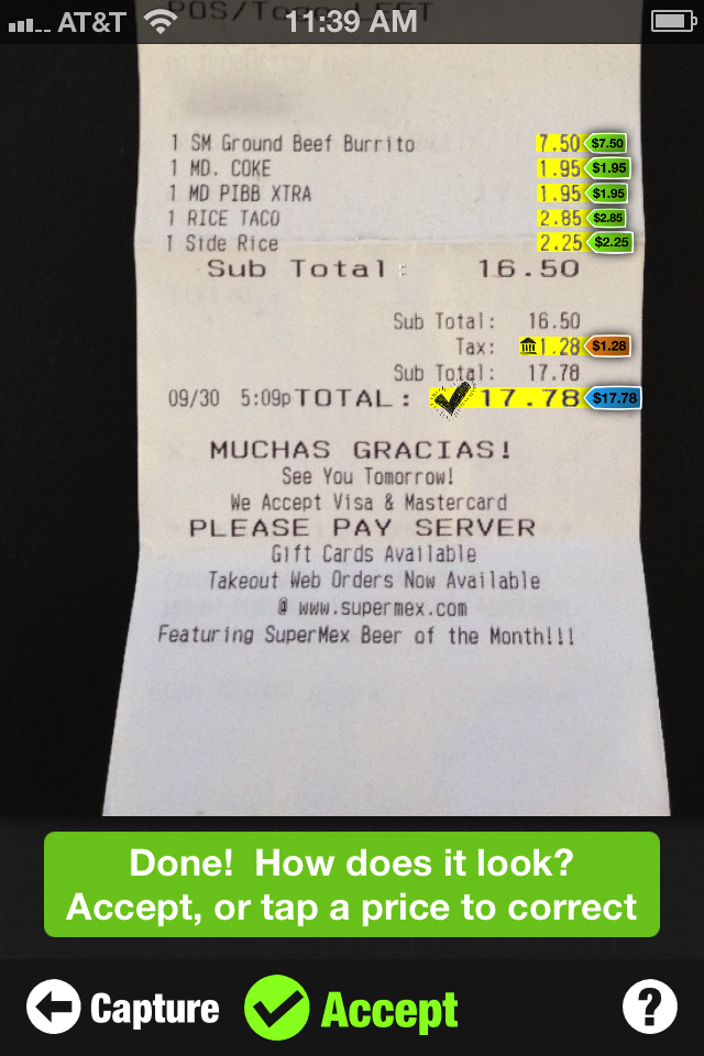
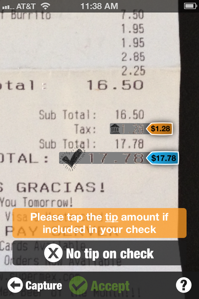
You open the app and it asks for you to take a picture of your bill. As soon as you snap the picture, OCR (optical character recognition) software scans the receipt and begins asking you to identify certain items. First, it has you touch the total amount on the check, then it asks you to identify the tax followed by a tip (if it’s included), and lastly coupons or discounts applied. Once these items have been identified, you then drag and drop each item onto an icon representing the diners and voilà! The bill is split.
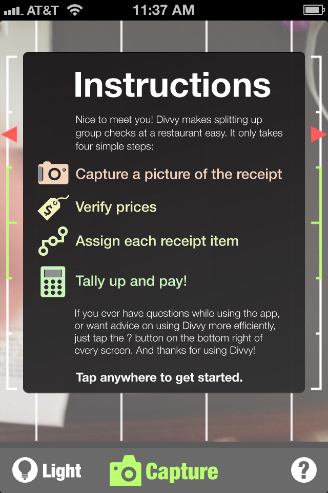
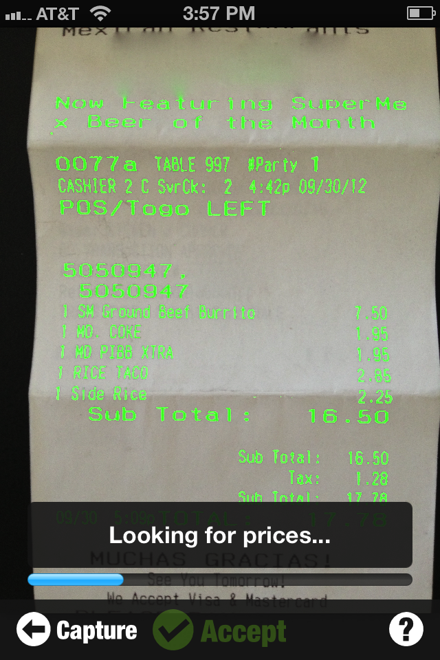 Seems simple enough, right? Well, there’s a lot of stuff going on that should be appreciated. First, some hardware details. This app is only available for the iPhone 4 and newer. I suspect the OCR software needs a high-res camera. Second, as you’re taking the picture of the check, constant and immediate feedback is displayed, guiding you to take a usable image. A grid helps straighten the receipt on the screen, the accelerometer arrows help with the camera tilt, and written prompts indicate if you need to turn the flash on or change the camera angle.
Once you begin identifying the objects, you can pinch and zoom to magnify the numbers if you don’t have a steady hand or fat fingers. If something isn’t properly identified, you can touch on the item and add your own price and identify what it is based on a pre-defined drop-down menu (this also allows you to ignore an item).
 When it’s time to divvy the bill, the image automatically identifies and zooms to the item descriptions (burrito, coke, rice taco, etc.). Again, written prompts help throughout the splitting process. Tap the diner icons once things are divvied up and it will highlight all the items you’re responsible for.
By default, it displays four icons that represent all of the diners. Tap a plus symbol and you can add as many as you’d like from 21 preloaded designs. You can also add diners from the headshots in your phone’s address book or add people by taking a quick photo.
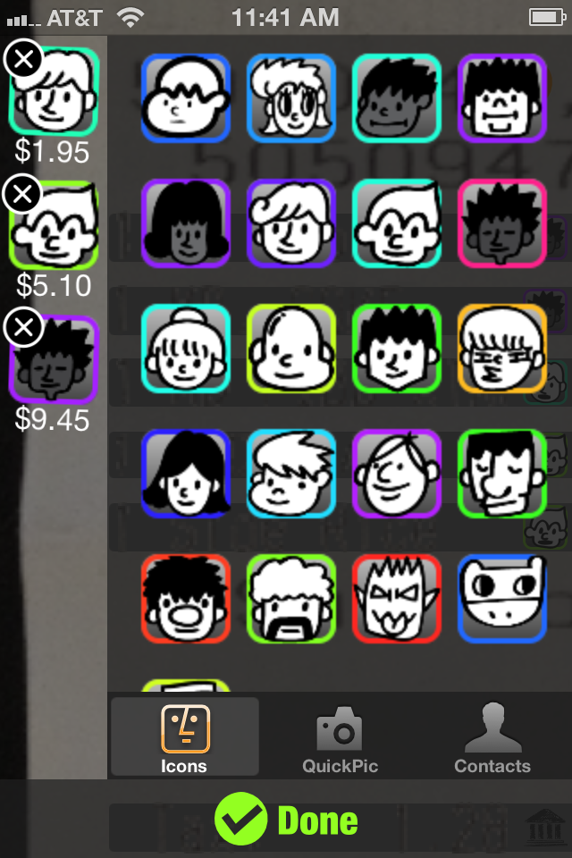 Dragging items brings up two other options. The first is to split an item and the other is to split an item evenly amongst all the diners. The difference is when you’re splitting an item, you can divide it by fractions (automatically calculated by tapping on the diner icons). For example, if someone buys a burger and the person next to them wants just the fries, they might decide to split the item 1/3 to 2/3.
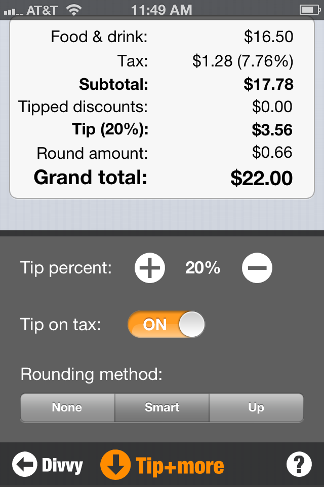
Once the bill is split, it’s time to observe the damage on the amount due page. A quick breakdown shows what each diner owes. A dropdown arrow shows an itemized list for each person. What’s really slick is if a few people want to pay together, simply drag them together and their amounts merge. Want to adjust the tip? No problem. Change the tip percentage up or down. You can also round the tip so that each person pays an even dollar amount. If you think your server did a good job, you may round up, giving them the benefit of those loose nickels and dimes. The tax amount, by the way, is also automatically adjusted based on the items associated with your individual purchases.
 There’s a ton of power in this little app and it’s nearly flawless in design. If I’m going to get picky, I’d say scrolling through my huge address book (which only shows a head shot and first name to simplify things) is a little cumbersome. I would like to see the alphabet on the side to make it easier to jump and scrub down the list to a name like Tom, for example. Outside of that, the only other knock I have is that there’s no home button. You must either completely close the application or click the back button several times to use the app on a subsequent occasion.
Taking math problems with fractions and percentages and making them visual and as simple as drag and drop is an impressive feat. This is the type of app that will make me wonder a year from now how I ever figured out a restaurant check with just a calculator. I don’t think I’ve ever gone to a restaurant looking forward to the bill at the end of the night, but with this app I can’t wait to dazzle the table with Divvy.
Toque Rating: 4.75/5
Hey there
I was wondering if you were interested in media exposure for your business. We think that you have an awesome story and our associated journalists would love to write about you.
Please let me know if you’d like to discuss! Let’s find a time to talk.
Amanda
hello@otterpr.com
otterpr.com/consult